
Itse
Pilates Itself

A Fresh Perspective in Business Management
Growing a business quickly comes with many challenges. Exvos, an experienced Business Management Advisory, excels in building sustainable growth for their clients. With a strategic focus on long-term success, they offer a comprehensive suite of high-performance programs designed to accelerate and develop the next generation of business leaders. These programs empower leaders with the knowledge, wisdom, and tools necessary to elevate their businesses to new heights. Exvos doesn’t just help businesses grow; they transform them into great companies with the resilience to stand the test of time, ensuring lasting success in a competitive market.
When Exvos sought to refresh their brand to better reflect their mission and values, they turned to SML. We undertook a comprehensive rebranding strategy, focusing on creating a modern, sophisticated identity that would resonate with their target audience of emerging business leaders. From refining their visual identity to revamping their messaging, we ensured that every element of their brand communicated the promise of sustainable growth and leadership excellence. The result was a cohesive brand that not only reflects Exvos’s core values but also positions them as a leading authority in business management advisory.”
The Business Management space is a vast landscape of consultants and advisors that work within a generally conservative aesthetic. Exvos wanted a fresh and unique brand to reflect their expertise in producing high-performance programs that result in positive work environments that engage, motivate and inspire. Our desire was to reflect this philosophy to give the brand the right framework for how they work and connect with their clients and importantly to create standout amongst big industry competitors.
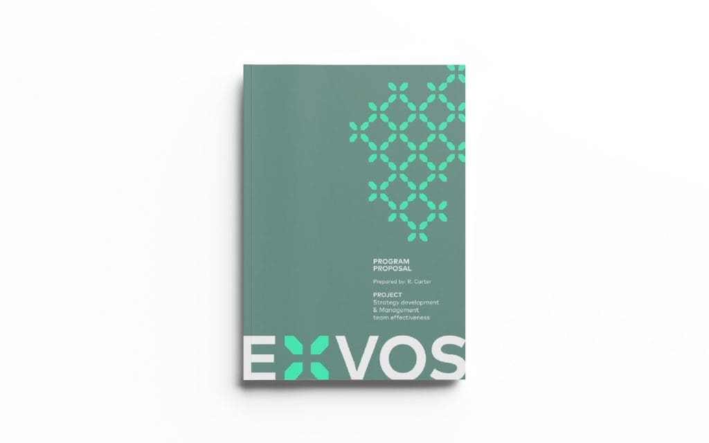
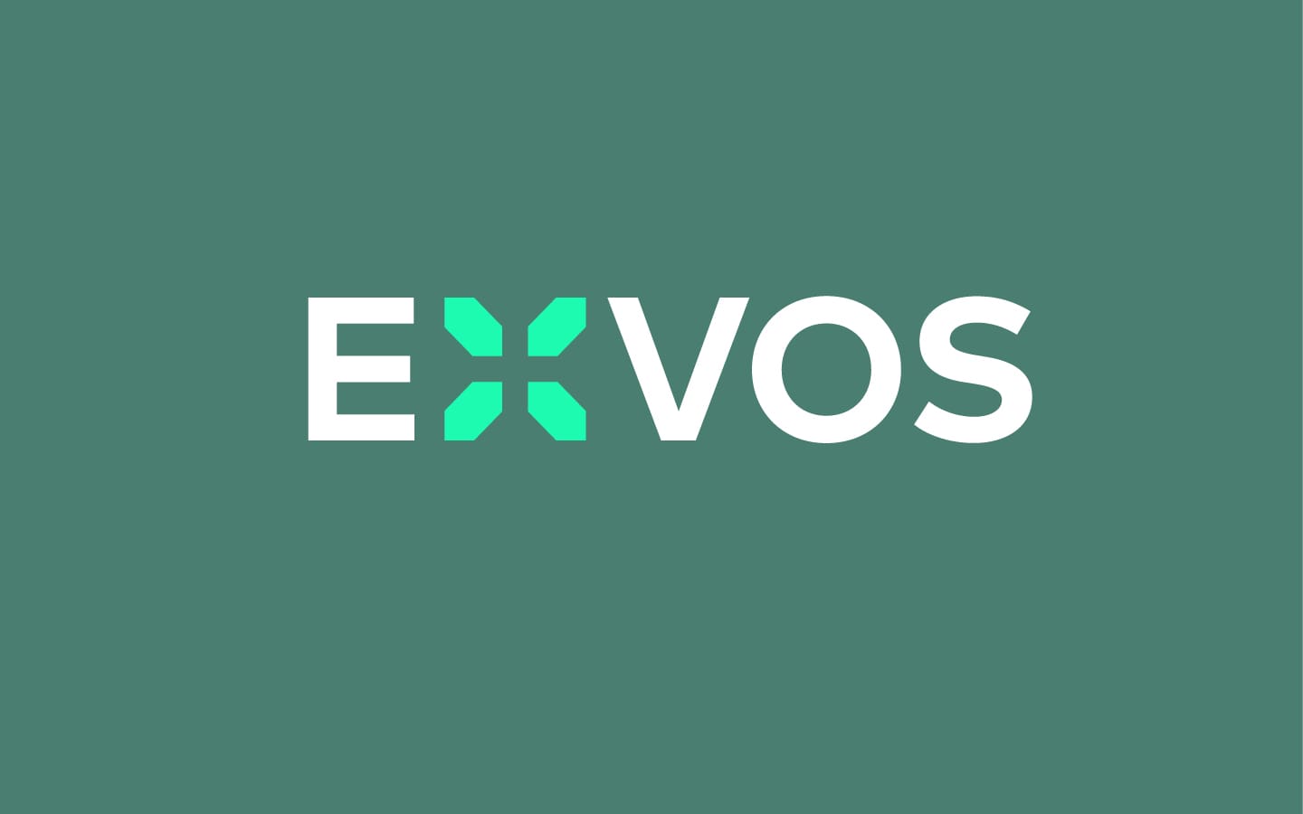
Our approach was to create a simple strong wordmark that speaks to the client’s core business expertise. The X within the logotype symbolizes the X factor and high-performance achievements they bring to each client. Within the X is also the ‘plus’ that represents their forensic accounting expertise and the positive motivational results they envision. The X multiplies across graphic applications as a pattern representing business culture, fast-growth companies, and networks. The colour palette of sage green was chosen for its qualities of wisdom, judgment, and experience in conjunction with the mint green representing originality, innovation, and new beginnings.